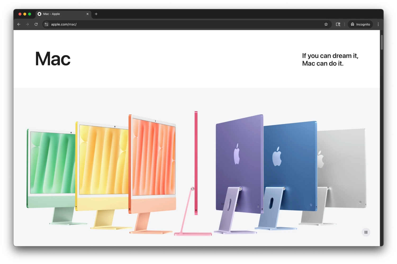
Apple > Mac
Apple.com exemplifies timeless minimalist design, masterfully combining spacious layouts, monochromatic palettes, and crisp typography to spotlight flagship products in an immersive, cinematic presentation. The homepage greets users with full-screen hero modules—often the latest iPhone or Mac—supported by bold headlines and concise subheads, minimizing distractions and encouraging focus . Navigation remains elegantly simple: a top menu with core categories and a persistent shopping cart and search icon ensures usability without visual clutter. Performance-wise, Baymard’s UX study ranks Apple at the top 1% for mobile homepage and category UX. The recent adoption of the “Liquid Glass” aesthetic across OS platforms hints at a future shift—introducing translucent layers and dynamic depth—even though early user feedback suggests potential concerns around legibility in bright conditions. Overall, apple.com continues to feel elevated: its refined restraint, unwavering attention to detail, and subtle visual hierarchy deliver an elegant, intuitive browsing and shopping experience.