The Oppenheim Group
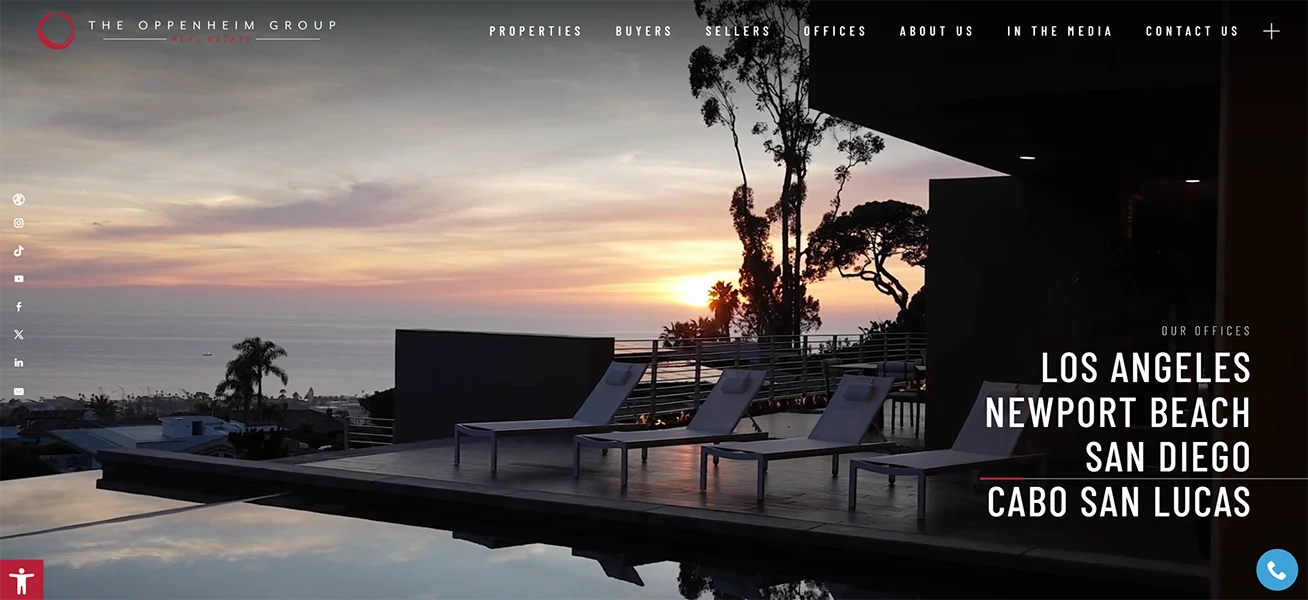
The Oppenheim Group’s website (ogroup.com) delivers a sleek, high-end experience that matches the brand’s luxury positioning. Right away, the design leans into bold imagery, dramatic spacing, and modern typography that makes the site feel more like a curated editorial than a standard real estate brokerage page. Even with all the visual punch, the layout still feels intentional and navigable, guiding visitors smoothly from the hero content into the sections that matter most.
A standout strength is how the site balances property-first browsing with brand storytelling. The featured listings section is presented in a clean, card-style grid that makes it easy to scan homes quickly, while the surrounding content reinforces the “why” behind the company—team visibility, high-level stats, and a strong emphasis on their lifestyle-driven approach to luxury real estate. It’s a smart mix: you can shop listings like a serious buyer, but you also get consistent reminders that this is a well-known, media-forward brokerage with a polished identity.
The call-to-action flow is also well done. Instead of feeling pushy, the CTAs are embedded naturally throughout the experience—whether you’re exploring listings, learning about the team, or scrolling through media features like Netflix-related sections, concierge-style service content, and community/philanthropy highlights. Add in elements like app promotion, lifestyle magazine positioning, social integration, and credibility signals near the footer, and the site ends up feeling both aspirational and functional—built to convert, but also built to impress.